
Step-by-Step How to Brighten & Touch-up Dark Photos
A follow up article to my "Low-light vs.. Just Dark Photos" I am going to go into more detail on quick touch-up work I did to the photos that were to dark. In commercial photograph I am incredibly fast like most photographers with deadlines. Usually I can edit 100-200 photos an hour if I got my exposures even. As you will see in this article it is amazing what you can get out of a dark photo with little editing in a short time, I have learn a lot of tricks and I'm happy to share. If you wanna be a successful commercial photographer you have to be fast.
I mainly use Adobe Lightroom like most of the photography community, the other is usually aperture from Apple. I highly recommend lightroom over aperture, photoshop as well, for general editing. Lightroom is easier, quarter the cost of photoshop and it does about 90% of what you need for most editing you'd do on your photos. Photoshop is better for very detailed touch ups or adding/subtracting elements from your photo. Lightroom over aperture is more universal and supported with more plug-ins than any other software, so that is what I'm gonna use to show you my editing process with this step-by-step guide.
I do portrait photography around various resorts on the Big Island of Hawaii. People love the sunset photo shoot times so they have the amazing colors in the background. A good sunset takes the hard work out of making your photo stunning.
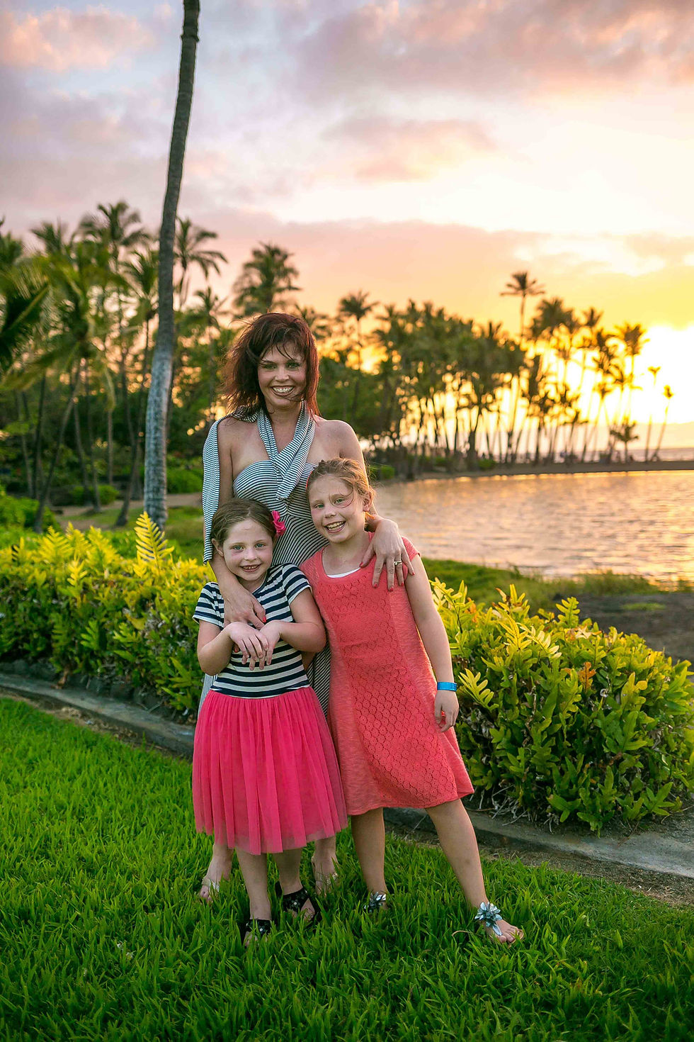
Here is a great example. This little gem is clearly to dark as is. I always use a flash at sunset. This point in the shoot my batteries died in the middle of shooting, so I had to work with what I got. All the other versions of this pic I took the subjects eyes were not all looking straight so I had to make this shot work cause I knew they would love it when finished. Fortunately the light was perfectly even everywhere thanks to the clouds over the sunset so I lost no detail anywhere. That is key, if you have no highlights and 50% of the photo is black then it will be very hard to brighten without degrading the picture quality.
Note that for the sake of the blog and not have huge loading times these files are small so there will be a little artifacting. I assure you there is not a single visible pixel on photo. These came from the Canon 5D Mark III.

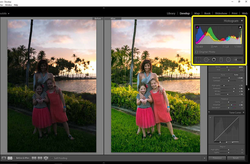
Here's the original. More silhouette then nice portrait, far to dark. Top corner shows the histogram of the light and color of the photo. All you really need to know about these is that generally you want a more even set of curves across the whole chart, not one end of it. That means it's a proper exposure, all colors and light levels* are represented. You will see it change as I edit. (*Light levels the more technical term used to define the tone curve of your photo, exposure. It goes highlights, lights, darks, shadows.) It's all about balancing them. Thanks to editing software that simplifies it and does the balancing for you, you don't have to mess around with the tone curve. (Click here for Histogram chart explaination article)
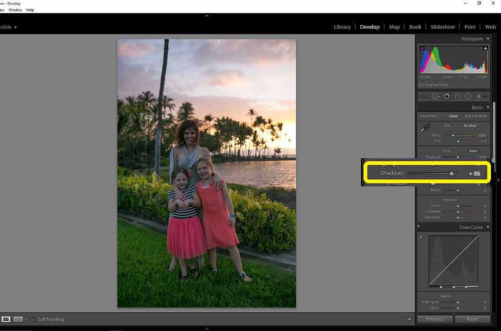
I first start with shadows cause increasing my shadows lets me see what details are left in the darks in a controlled way, exposure brightens everything to much at first. I've almost maxed out the slider just to bring back it back. (Never max out the sliders if possible, usually you loose detail.) I change shadows before exposure because I can adjust and layer in the dark levels the exact way I want without changing the whole exposure.

Now I increase the exposure by half a stop. (Each +1 on the exposure slider represents one stop of exposure, the max is +/-5 stops.) Now my darks & lights are evenly visible. Note the histogram now compared to the beginning. My darks are balanced, I have them lock-in how I'd want them. I can now adjust the lights. I edit photos in this order so I can adjust the whites & blacks like a painter does, gradually layering. This helps maintain soft light and balance the highlights & shadows.
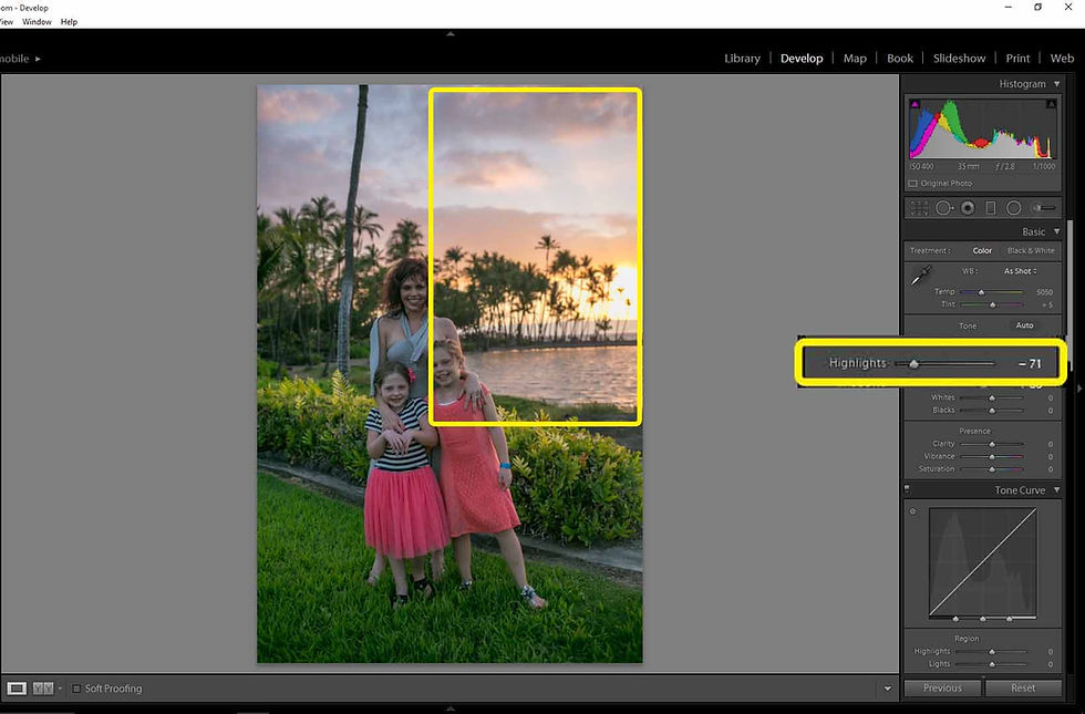
I adjust my highlights now. Since the photo is all evenly toned only the bright sun in the back ground will be adjust for the most part. Lowering the highlights correct the over exposed whites that adjust my exposure earlier caused. This will make the sunset more defined rather then blown out and more of the color spectrum comes through. A lot of editing is adding or subtracting white or blacks then tuning the levels with highlights and shadows.

Now the final adjustment to even the pic out, whites. I down play the highlights first so when I'm increasing the whites I can see when the whites or colors start getting blown out. I know that's the limit of the photo's levels cause I already corrected for them. The photo is still a little dark, you could just up the exposure more and be done with it. How I approach it is by adding highlights, I'll maintain my detailed colorful sunset this way and keep the blacks the way I want them. Being able to see the clouds really helps the sunset look better.
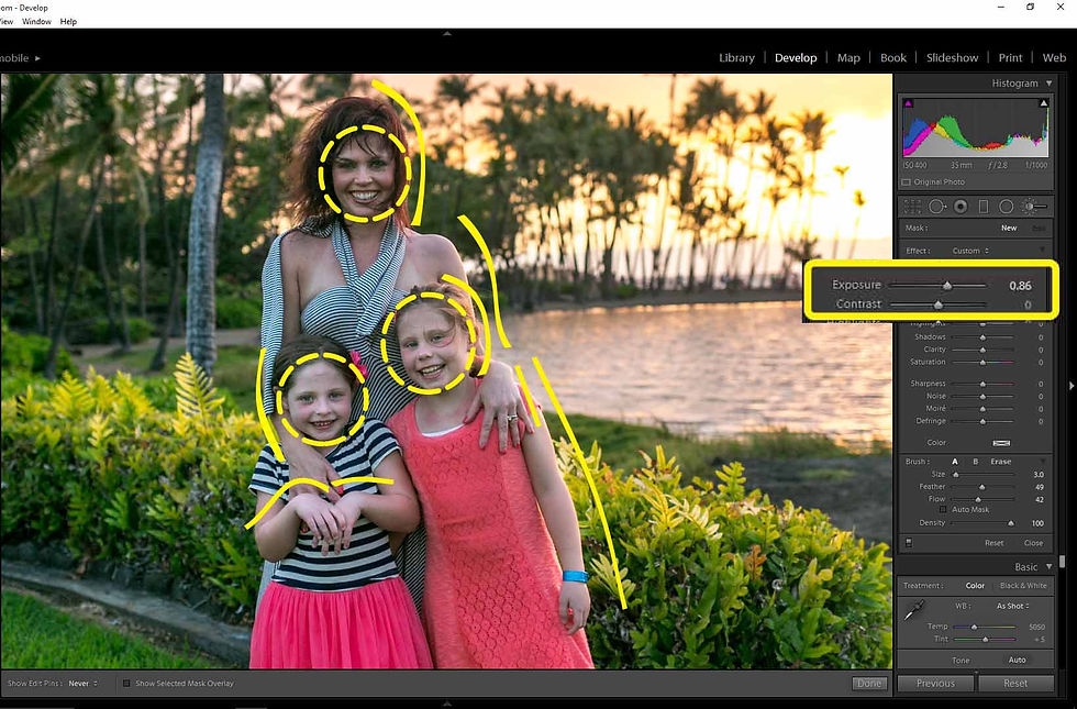
Now on the side you can see that the brush I'm gonna use to add highlights is about 4/5th a stop. I set the brush to how much more light I think the whites need. With one stroke I run the brush down edges with highlights. The arms, hands and side of the head. One quick stroke with your brush is all you should need, if to dark or bright just adjust with the slider. Next are the faces. I'll paint over the whole face. Then I tweak the faces more by adjusting the highlights and shadows in the adjustment brush window. Then I make one more brush that's maybe half a stop just as big as their eyes. Again I click once just on the eye then I brighten them.
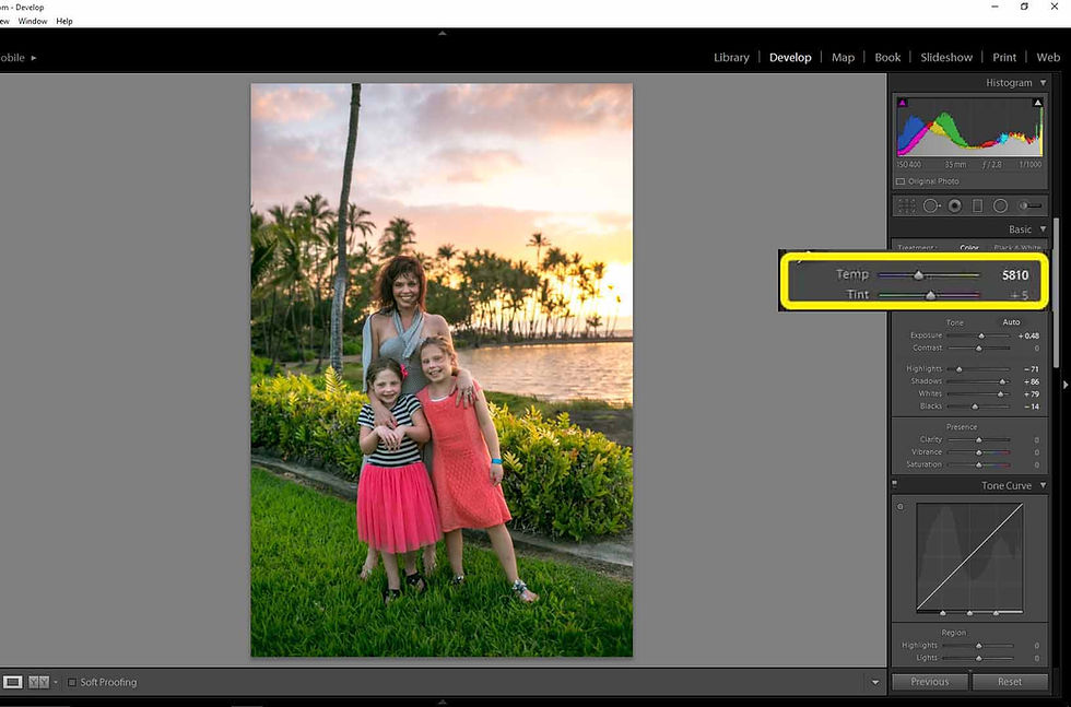
After exposure I deal with color. Reason for this order is because your photo's colors will change with exposure. That's why a super bright photo looks washed out with little color, all the color has gone white. Same for dark colors going black. Another concept that many don't know is that exposure controls the tone of the colors, making it more influential then saturation and vibrance. With sunset's I shoot a little extra warm, the reason I do this is because no one wants a cold looking photo of their family on the beach in Hawaii. Cooler white balance temperatures have their place, I feel just not with a vibrant warm beach sunset. Also since warm white balance is associated with sunset colors (Red, orange, yellow, gold) all the highlights with those colors get brighten a little bit. Warmth white balance will brighten a photo and cold with darken a photo generally.
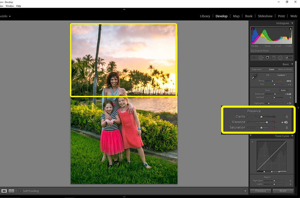
Temperature I have the way I want. I use vibrance most often because saturation boosts color more or less intensely, vibrance has a lighter touch and rarely makes your colors peak. I increased the vibrance about half way up the sIider. My rule, I increase vibrance right before colors start to loose their variety and gradient. When the sky is only solid orange or blue then its to much. Some like that look, but people can start to have orange umpa-lumpa faces. So my color is now great everywhere, except for the little girls dresses... The colors are to vibrant, bordering on fluorescent color. To startling to the eye, it distracts from the sunset which should be the point of most color. Thanks to easy Lightroom it is an easy fix.

The box on the side shows the Lightroom window marked "HSL / Color/ B&W." This is where you control individual color channels, meaning one color out of the spectrum. This is another invaluable tool that a lot of people forget about. When your photo is perfect besides one pesky shade of color you can change the hue, saturation and luminance (Lighter or Darker.) So I dial the saturation down just 15% and same with the luminance. Now the girls dresses look more normal. Thus concluding my color adjustments. Down the home stretch now. Not much left.
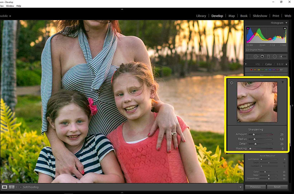
On to sharpness. Traditionally and still today portraits have had a more soft focus. Soft features are more attractive then sharp lines on a subject face. I like photos with crisp detail so I always sharpen. This window show the photo sharpness. It's is pretty good, but since its a more wide full body shot I want more detail so it looks sharp from a distance of if the client want a big poster size print. It's subtle but photos also come off more solid and crisp when sharp I've found.
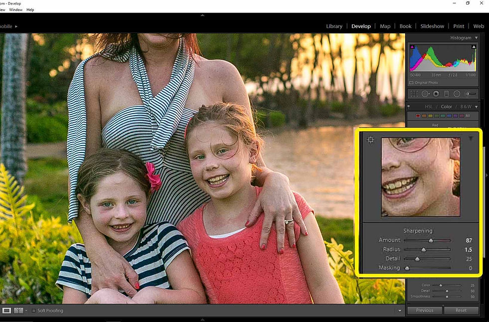
So I increased the sharpness +87 and up'd the radius (Radius controls the size of the grain in the photo.) I increase radius so the lines are more bold. Helpful for the stripe clothing in the shot, the colors aren't bleeding together. Sharpness will however create more noise in you photo if there is any, since this was a dark photo there is noticeably more noise on everyone's skin. I do this so when my background and lines are solid I can correct for skin after and still keep detail. Once again, layering.

Instead of using the mask slider right under the sharpness & radius sliders I use noise reduction to do the job for me. The sharpening mask I've found is almost always counter intuitive. It's meant to smooth out the grain but it just reverses what you just sharpened because it blurs the grain. I've found the noise reduction luminance slider works best. It gets rid of the noise and smoothes the skin tones while maintaining the lines.
Pau! The photo is done! (Pau means done or off work in Hawaii)
Here is the comparison between the to. Amazing right? The histogram is looking more like it should. There never is the "correct shape" it's just a frame of reference. Like tone curve it is not really crucial to go by. I always say follow what you eye says looks good. Mine says it looks great and so did these clients. Here is it full size.
Recap
I first start with shadows cause increasing my shadows lets me see what details are left in the darks in a controlled way, exposure brightens everything to much at first.
I edit photos in this order so I can adjust the whites & blacks like a painter does, gradually layering. This helps maintain soft light and balance the highlights & shadows.
A lot of editing is adding or subtracting white or blacks then tuning the levels with highlights and shadows.
I down play the highlights first so when I'm increasing the whites I can see when the whites or colors start getting blown out.
I set the brush to how much more light I think the whites need. With one stroke I run the brush down edges with highlights.
Another concept that many don't know is that exposure controls the tone of colors, making it more influential then saturation and vibrance. Warmth white balance will brighten a photo and cold with darken a photo generally.
My rule, I increase vibrance right before colors start to loose their variety and gradient. When the sky is only solid orange or blue then its to much.
The box on the side shows the Lightroom window marked "HSL / Color/ B&W." This is where you control individual color channels, meaning one color out of the spectrum. This is another invaluable tool that a lot of people forget about.
More wide full body shot I want more detail so it looks sharp from a distance of if the client want a big poster size print. It's subtle but photos also come off more solid and crisp when sharp I've found.
I've found the noise reduction luminescence slider works best. It gets rid of the noise and smoothes the skin tones while maintaining the lines.
Lightroom is an invaluable tool all together. I've gone back to old photos I've taken and saved them with lightroom, with every new edition the algorithms for better photo improvement.
Most of my own work is more vibrant then some other photographers like. Remember though you regularly aren't selling to photographers. If your gonna do commercial work or sell your own fine art photos you have to create what sells, all my work sells the way I edit them. I stand on that.
Most clients that are gonna buy your commercial portrait work want pretty & colorful photos to hang up put simply. They have plenty of cell phone photos with average washed out color. I know there are neutral tone & other style of pics that are amazing, however only more art concision people appreciate it. Most people wanting a portrait shoot of their family want the photos to look very "nice." Especially if they dropped thousands of $$$ to visit & see the tropical sunset. (Can't tell you how many other photographers I worked around went for super cold sunset pics, they very rarely sold.) My advice show the clients normal colorful photo then had another version of it with another color style so they have a choice. I'll 3 different versions sometimes.
Thanks for reading and hoped I help. Good luck with your photos!


Comments